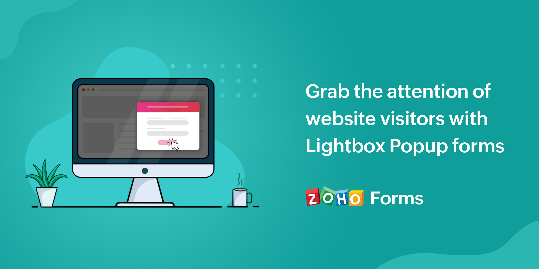
Lightbox forms are interactive elements that overlay a web page's content, usually in the form of a pop-up. They grab the attention of users to interact with them, prompting specific actions such as providing contact information or engaging with a call-to-action.

Key features of lightbox forms
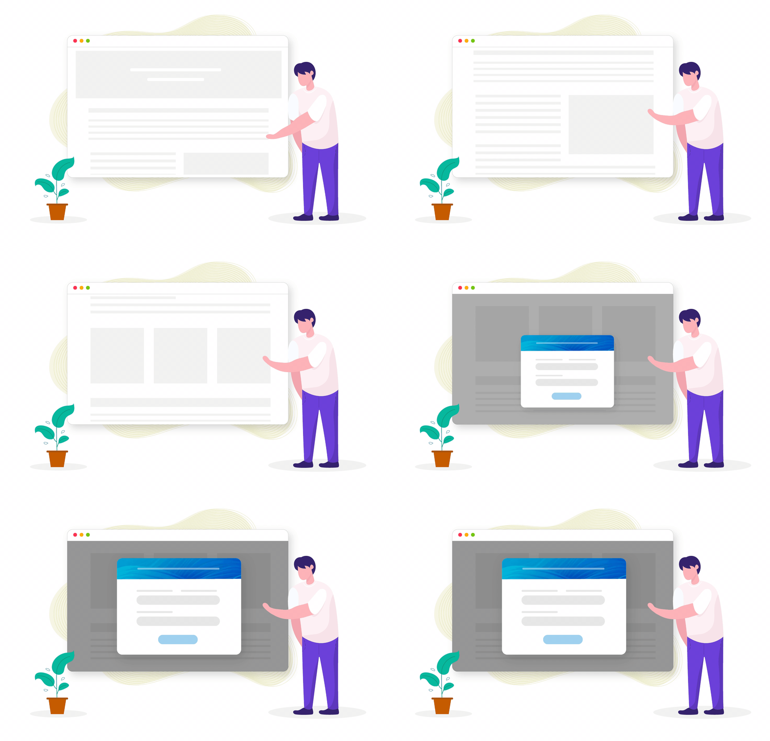
Lightbox forms create an overlay effect by dimming the background content, drawing attention to the pop-up and making it visually prominent, preventing visitors from interacting with the underlying content until they dismiss or complete the form.

Lightbox forms can be triggered by various actions, such as a timed delay, scrolling behavior, exit intent (detecting when a user is about to leave the page), or clicking on a specific element or button.
Lightbox forms can be customized to match the website's branding and design, allowing for flexibility in layout, colors, fonts, and images.
They feature a clear call-to-action, which could be subscribing to a newsletter, requesting a demo, or making a purchase.
The purpose of lightbox forms is to engage visitors, capture leads, promote conversions, and provide a more interactive and personalized user experience.
Advantages of placing a lightbox form on your webpage
Lightbox forms can improve the user experience by offering a convenient way for website visitors to take action without leaving the page they are on. By offering a streamlined experience, visitors are more likely to engage with the content and take the desired action.
Lightbox forms can be strategically placed to encourage visitors to take a specific action, such as signing up for a newsletter or purchasing a product. By presenting the form at the right time and in the right location, website owners can increase the likelihood of conversions and sales.
Lightbox forms can also be used to reduce bounce rates by offering visitors a reason to stay on the site longer.
However, it is important to use lightbox forms thoughtfully, avoid overwhelming visitors with too many forms, or intrusive implementation that may disrupt the user's browsing experience.
Things to remember before putting up Lightbox forms on your webpages
- Ensure that the content of your lightbox form is relevant to the webpage where it appears. Align the form with the context and purpose of the page to increase its impact and avoid confusing or distracting visitors.
- Set an appropriate timing for the lightbox form to appear. Consider factors such as user engagement, scrolling behavior, or time spent on the page. Displaying the form too soon or too late may impact its effectiveness.
- Displaying forms too frequently can be intrusive and annoy users. Strike a balance between capturing attention and respecting the user's browsing experience.
- Craft clear and concise copy for your lightbox form. Use persuasive language that clearly communicates the value proposition or benefits of taking action. Keep the form fields and instructions straightforward to make it easy for users to understand and complete.
Zoho Forms offers lightbox pop-up forms that can smoothly slide in/out or fade in/out on your webpage. You have the flexibility to customize the launch criteria, such as page load, exit intent, time duration, or scroll percentage. For example, you can set a fade-in animation and launch the form when a visitor has scrolled 50% of the page. Additionally, you can pre-load the pop-up form, ensuring it seamlessly integrates into your webpage at the specified trigger point.
Learn more about embedding a lightbox pop-up form on your website. While you are at it, let us know in the comments how lightbox pop-ups helped you increase your conversions and sign ups.
Great article! I particularly enjoyed the way you presented your ideas in a clear and concise manner. Your insights were thought-provoking and informative.