10 essential project management reports every team should use

Let’s be honest about how projects usually go sideways. A task gets blocked and nobody notices. A dependency changes and nobody updates the plan. A senior stakeholder says “small tweak” and the team hears “new scope.” A key engineer goes on leave and the work shifts into the future.
Then you get that message: “Can we still ship by Friday?” And you don't have an answer, because there is no single space that tells the whole truth.
Reports are decision tools that reduce surprise.
The 10 reports in this blog post are the ones you use when you want to run projects with confidence.
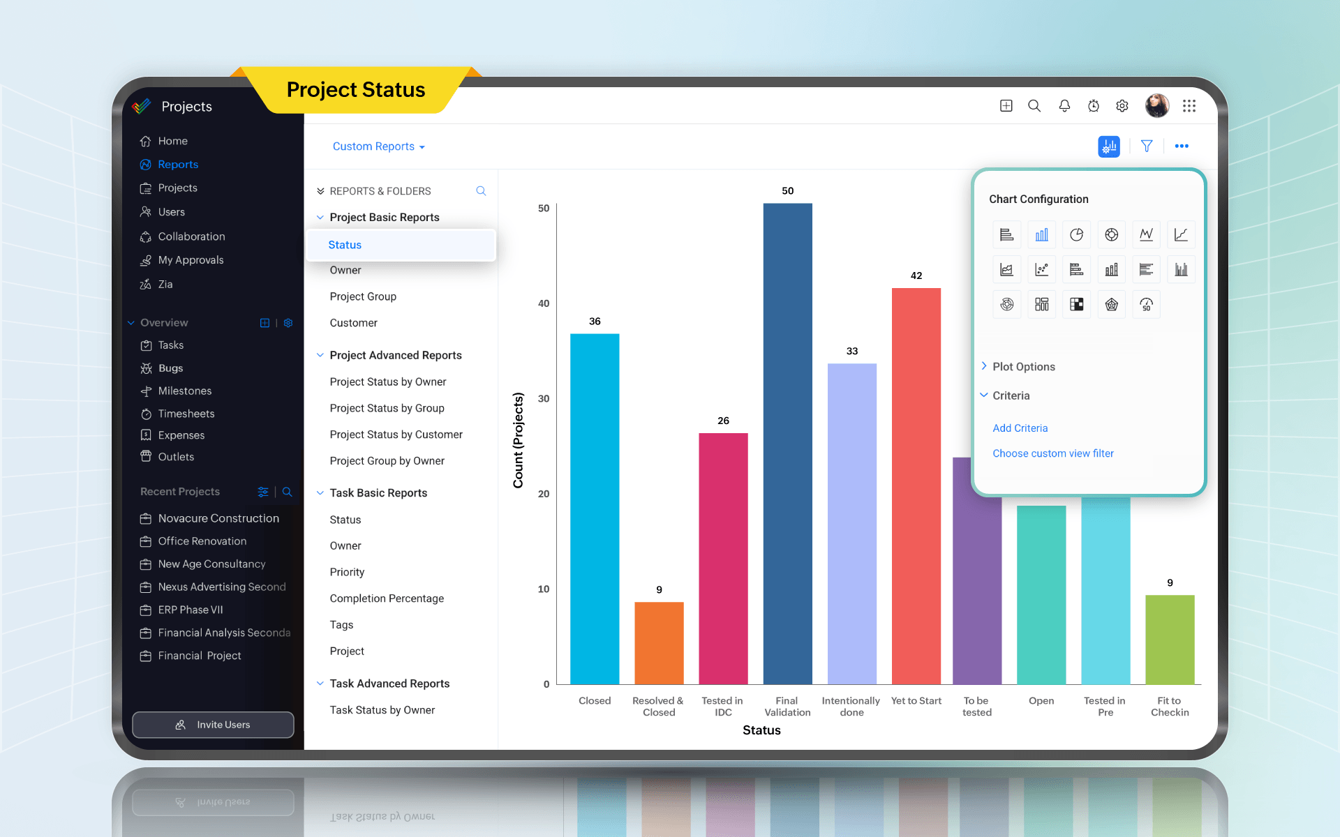
1. Project status report
Every week, someone in leadership wants the same thing: a credible answer in under two minutes.
A good project status report has a bit of personality. It tells you what moved, what didn't, and what needs a decision.
A status summary should call out milestone progress and risks, and be clear about next steps and timeline confidence. Something like: “We can still hit March 28 if we get legal approval by March 12. Otherwise we slip by one week.” That single line prevents a lot of performative optimism.
A status report also stops scope creep from being invisible. When your report has a section called “What changed since last update,” stakeholders think twice before sliding in “just one more thing.”
In Zoho Projects
Zoho Projects includes a project dashboard that brings together milestone progress, budget health, team performance, and overdue tasks in one view. You can track status at a glance without pulling data from multiple places, and the dashboard updates as work moves. For teams that need deeper cross-project visibility, the Zoho Analytics integration adds over 50 pre-built reports and custom dashboards, so leadership can see project health across the portfolio without being pulled into task-level details.
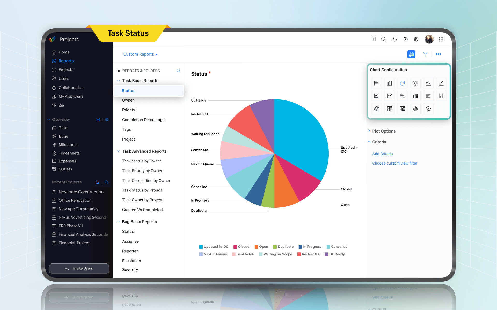
2. Task status report
Sometimes, what looks like progress may actually be tasks that are barely moving. That's why the task status report matters. It shows the shape of the work, not the narrative about the work.
The value here is the middle, during the “waiting on review” or “needs clarification” stage. If your middle stages balloon, you have a bottleneck. If your overdue count creeps up every week, you have either unrealistic planning or a resource problem.
You can slice this report in ways that instantly make your next decision obvious: by owner to see overload, by priority to see if urgent work is being neglected, and by milestone to see whether the “launch milestone” is actually realistic and achievable.
Keep in mind that if teams feel they're being monitored rather than supported, they will mark tasks done too early or split work items into micro-tasks to look productive. Ensure that this report is used to fix systems, not to single people out.
In Zoho Projects
Zoho Projects lets you build both basic and advanced task reports, filtering by status, owner, priority, or milestone. You can see how work is distributed across stages without exporting anything, and custom reports can be saved and reused. For teams that want to track task trends over time, the Zoho Analytics integration lets you visualize task creation vs. completion rates, overdue patterns, and bottlenecks across projects in a single dashboard.
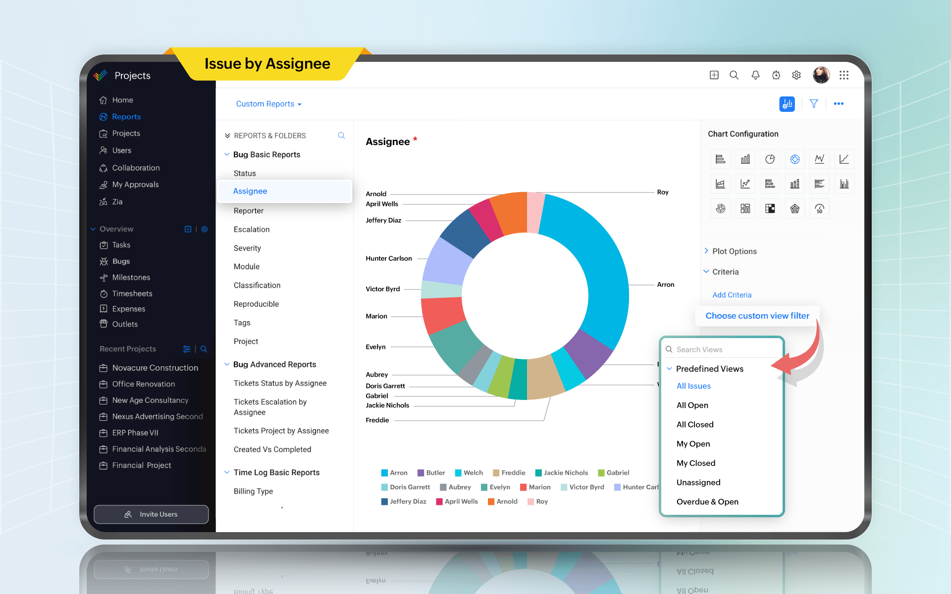
3. Issue report
The problem with issues is not that they exist, but that they tend to live in someone's head, a Slack message, or a comment buried three levels deep in a task. Usually, this is because there's no dedicated place that forces them to the surface.
An issue report changes that by giving unplanned work a home. Bugs, blockers, unexpected dependencies, things that broke in testing, things a stakeholder flagged on a call—when those land in an issue tracker with a status, an owner, and a due date, they become much more manageable.
If new issues are being created faster than they're being closed, you're just discovering how broken it already is. If a cluster of issues sits with the same owner for two weeks, that person is a bottleneck or needs help. If issue count spikes after every release or every stakeholder review, you have a pattern worth understanding.
One thing teams get wrong is treating issues and tasks as the same thing. Tasks are commitments. Issues are reactions. Keeping them separate keeps planning honest.
In Zoho Projects
Zoho Projects has a dedicated Issues module that sits separately from the Tasks module. You can log issues with priority, status, owner, due date, and reproducibility, and run reports that show open vs. closed counts, issues by assignee, issues by priority, and overdue items. The separation means your task reports stay clean and your issue reports stay focused. You can also create custom issue reports to track whatever pattern matters most to your project, whether it's issues by module, by type, or by how long they have been open.
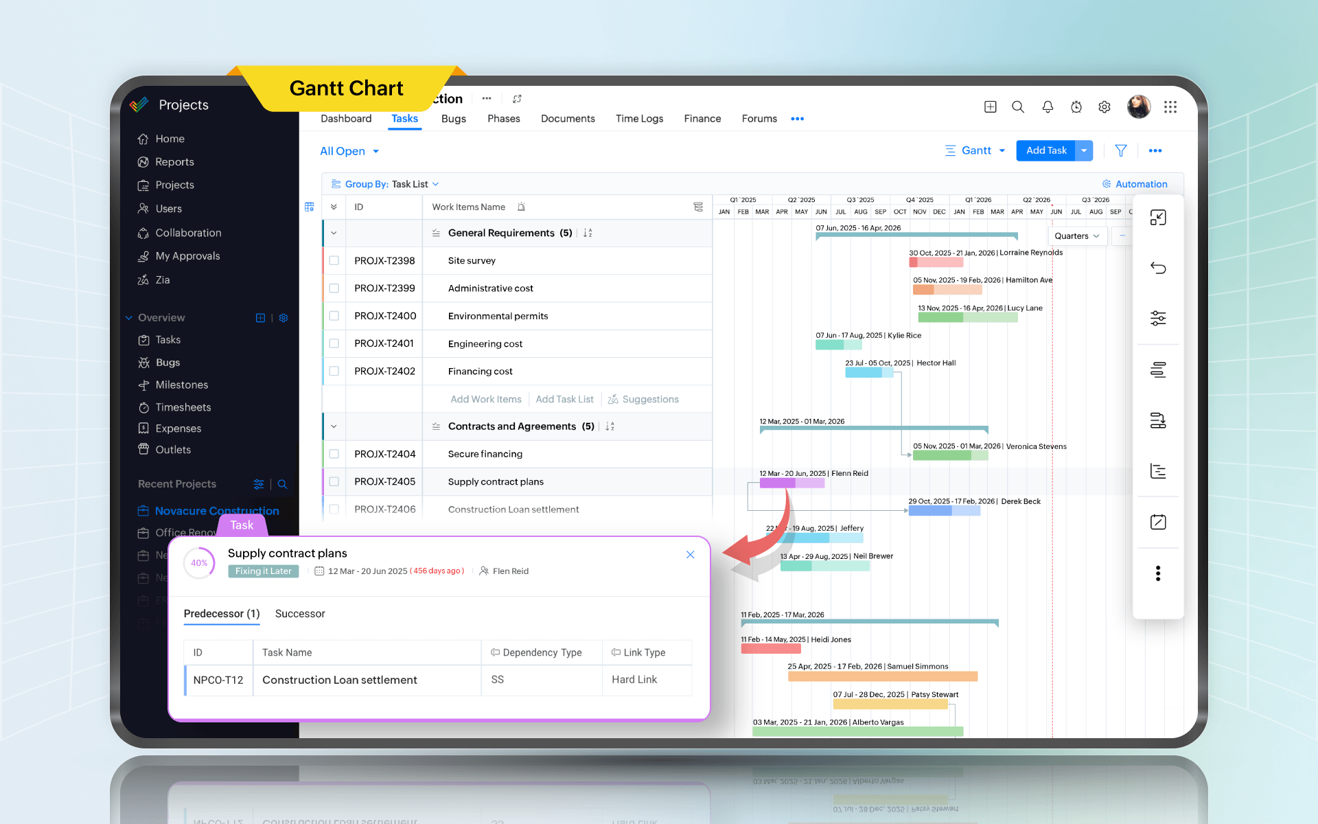
4. Gantt chart report
The brand team needs final creatives by April 5. Design says fine. Engineering says they need final creative specs by March 20 to build templates. Legal approval takes 10 business days. Someone updates the creative delivery date without updating the dependency chain. On paper, the date moved by three days. In reality, the whole launch moved by two weeks. And nobody noticed until the last minute.
A Gantt chart makes this chain reaction visible early. It also forces you to ask good questions. Which tasks are truly dependent? Which ones are parallel? Which tasks are gating, and which are on the critical path? Most importantly, what happens if this slips?
If your team does not like Gantt charts, that is fine. Many teams do not. But if you're managing cross-functional work with dependencies, some sort of timeline visualization is not optional.
In Zoho Projects
The Gantt chart in Zoho Projects supports four types of task dependencies and lets you reschedule work with drag-and-drop. It highlights the critical path so you can see which tasks directly affect your end date, and color-codes overdue work items so nothing gets missed. The baseline feature lets you lock your original plan and compare it against actual progress at any point, with a slippage indicator that shows which tasks have drifted and by how much. You can also set multiple baselines across the life of the project to track how the plan has evolved.
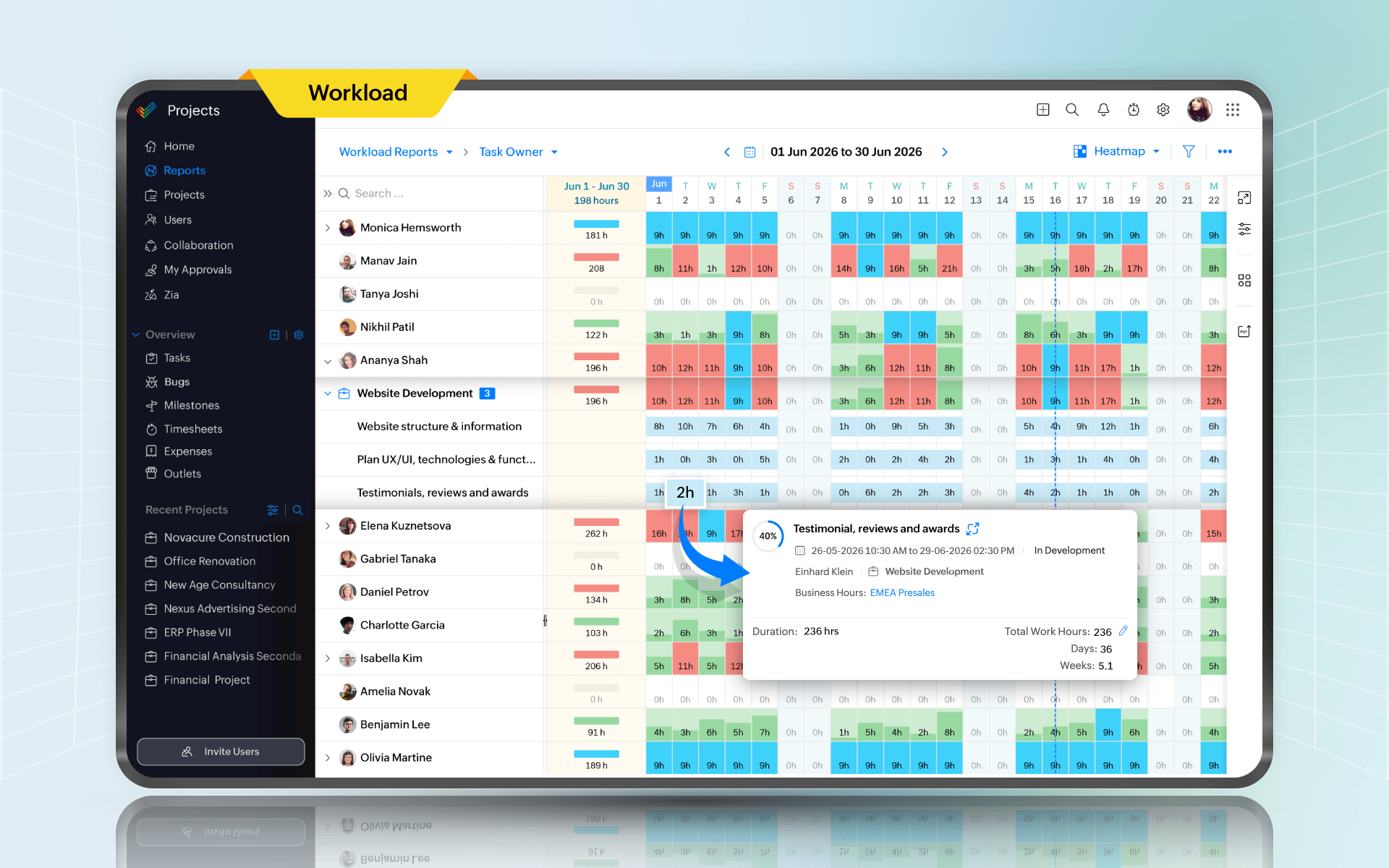
5. Workload report
Sometimes, teams commit to five parallel initiatives with the same two senior engineers. On the roadmap, it may look ambitious. On the utilization report, it’s a disaster in slow motion.
Utilization is about capacity risk. It tells you whether your commitments fit into your available human hours.
The most dangerous situation is sustained overutilization. Not a one-week spike, but sustained overload for a month. That's when quality drops, cycle times expand, and everyone becomes overwhelmed.
Underutilization matters too, but in a different way. It can signal poor planning, or it can signal that work is happening outside the system. Meetings, support, internal requests, random escalations. Those don't show up as assigned tasks, but they absolutely eat capacity.
In Zoho Projects
Zoho Projects includes a workload report that shows how each team member’s hours are allocated against available business hours, across daily, weekly, monthly, or custom date ranges. The chart makes over-allocation and free capacity visible without any manual calculation. From the same view, you can drag and drop task bars to reassign or reschedule work, so rebalancing the team does not require switching between screens.
6. Timesheet report
If you're in professional services, billing, client delivery, internal chargebacks, or any environment where cost matters, time logs are how you understand whether the project is profitable, whether estimates are realistic, and whether you're drowning in unplanned work.
Timesheets also reveal uncomfortable truths, like how much time disappears into meetings. Or how many hours go into rework because requirements were unclear. Or how much effort is spent supporting “small” stakeholder requests that were never planned.
The key is cultural. If people think timesheets are surveillance, they will log whatever data gets them approval. If they see time data being used to improve planning and reduce chaos, they will log honestly. That difference is everything.
In Zoho Projects
Zoho Projects tracks time at the task level and lets you classify every entry as billable or non-billable. Time can be logged against tasks, issues, and general logs, giving teams a complete picture of where hours are actually going, and can be used for client billing and payroll purposes. The platform supports a timesheet approval process so managers can review logged hours before they are locked, which helps keep data honest. A global timer widget also lets team members track time across tasks and issues without switching between projects.
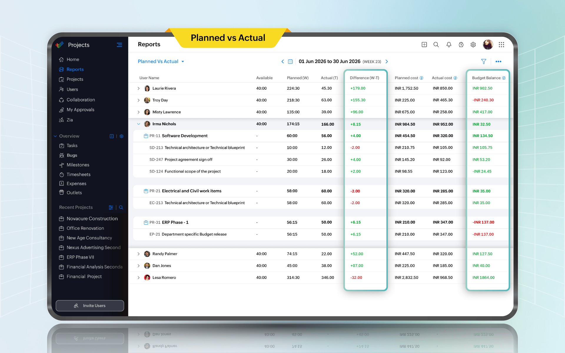
7. Planned vs. actual hours report
Planned vs. actual is about improving estimates and spotting hidden scope.
If actual hours keep exceeding planned hours in a certain type of work, you have a pattern. Maybe discovery is rushed, approvals are slow, or dependencies are flaky. Maybe the team consistently underestimates because they are optimistic. Whatever it is, this report gives you the evidence to fix the system.
For instance, if tasks involving external vendors are consistently over plan, that may not be because the team is slow, but because vendor response times are unpredictable. In this case, explicit wait-time buffers and negotiating earlier would help reduce variance.
In Zoho Projects
Zoho Projects has a planned vs. actual hours report that compares hours allocated to a task against hours actually logged, broken down by user. You can filter by project, user, and task status to focus the data on what matters for a given review. For teams on the Enterprise plan, the global version of this report pulls the comparison across all projects at once, which is where estimation patterns become clear enough to actually change how you plan.
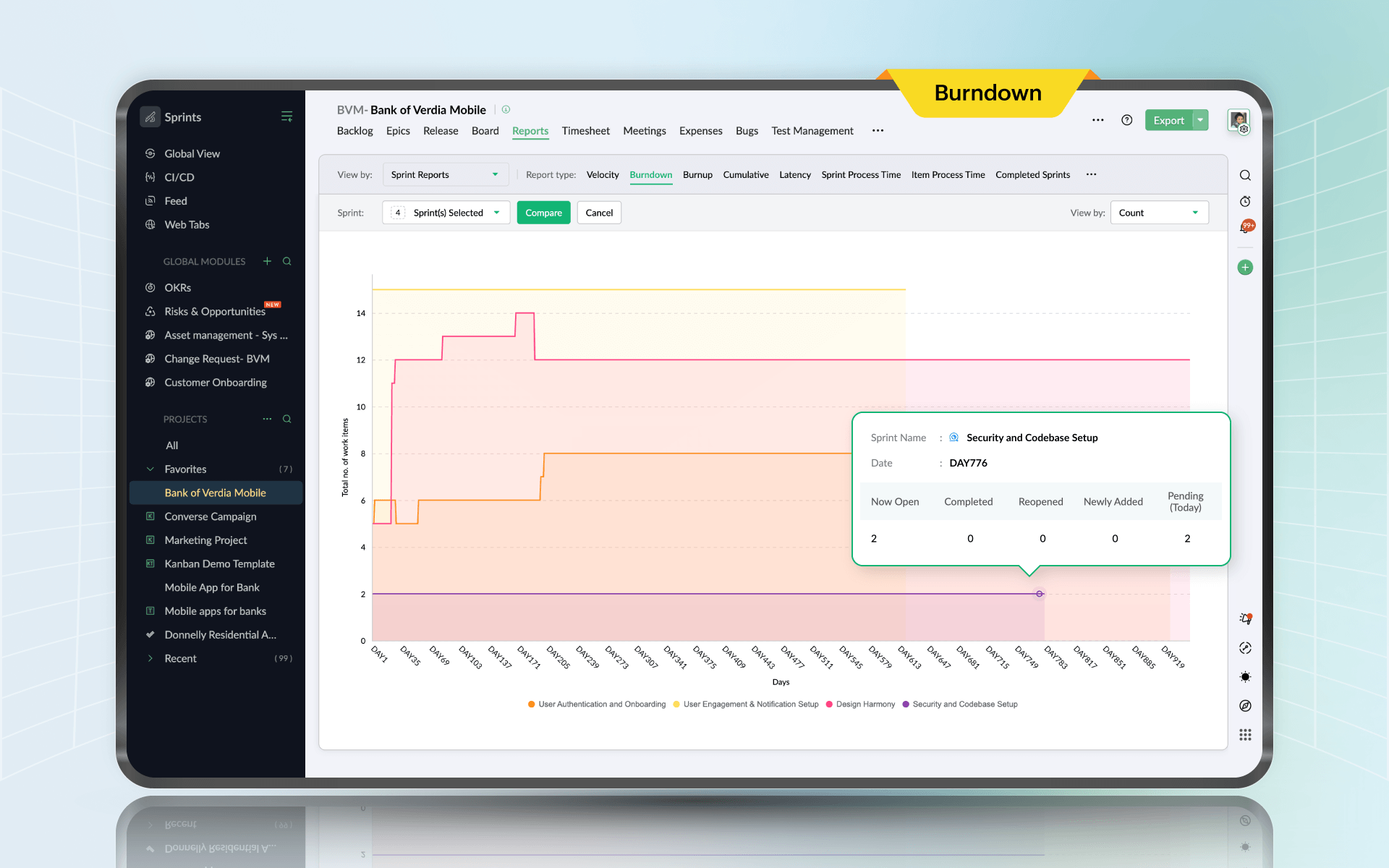
8. Sprint burndown chart
In an ideal sprint, the burndown slopes down smoothly. In real teams, burndowns have shape. A flat line early often means work is blocked or stories are too big. A cliff at the end often means testing and review piled up. A sudden upward spike usually means scope change.
Here is the practical value. You can look at a burndown and decide whether you need to cut scope, swarm on blockers, or move work out. That decision is cheap on day three and expensive on day nine.
Burndown also saves standups from becoming theater. Instead of everyone reporting activity, you can point at the chart and ask the real question: What do we need to do today to get back to a credible slope?
In Zoho Projects
Zoho Projects integrates natively with Zoho Sprints, and the burndown chart is one of the reports you get directly from that connection. It generates automatically from your sprint data and plots your actual progress line against the ideal burndown line, so divergence is visible early in the sprint rather than at the end. You can track burndown at both the sprint level and the epic level, and compare progress across multiple closed sprints to spot patterns in how your team tends to move through a cycle.
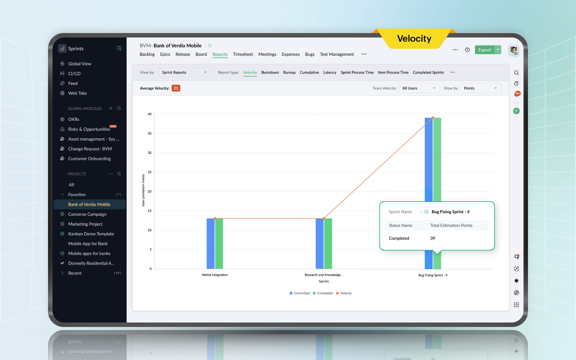
9. Velocity chart
The velocity chart tells you what the team tends to finish in a sprint. If the team’s rolling average is 28 points, committing to 40 is self-deception.
Velocity also helps you explain trade-offs to stakeholders. Instead of arguing about effort in abstract terms, you can say: "Based on our average, we can take these five stories or those three larger ones. Pick the outcome you want." That shifts the conversation from pressure to prioritization.
In Zoho Projects
Through the Zoho Projects integration with Zoho Sprints, the velocity chart is available as part of your sprint reporting inside the same platform. It compares committed estimation points against completed points for each sprint and calculates average velocity over time. You can also view velocity by number of items completed, depending on how your team estimates. The chart gives you a factual basis for sprint planning conversations and a clear way to show stakeholders why a given commitment is or is not realistic, grounded in what the team has actually delivered.
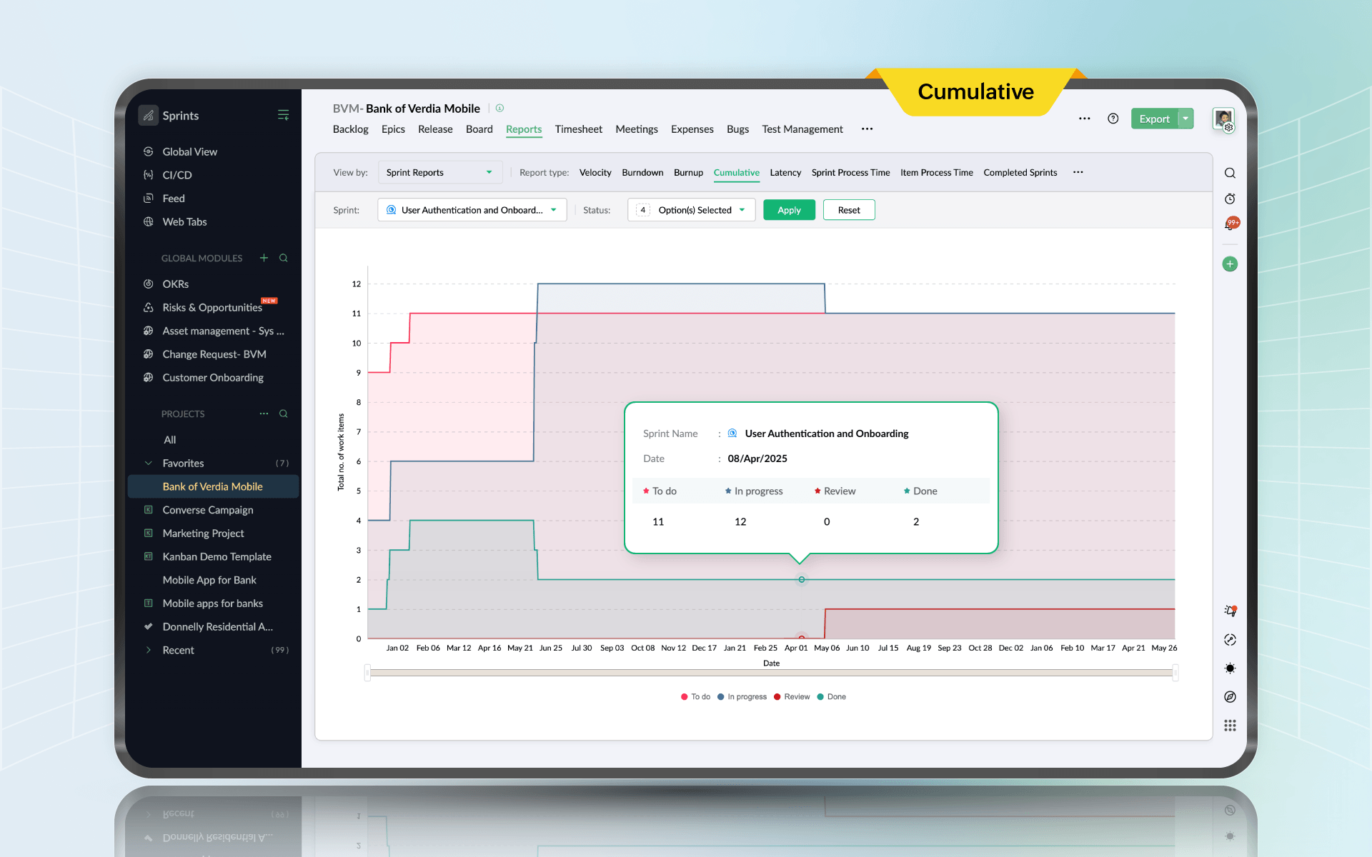
10. Cumulative flow diagram
The cumulative flow diagram (CFD) is the report that shows you where work gets stuck.
If the “In review” band widens, review is the bottleneck. If “In progress” widens, too much is started and not enough is finished. If “To do” balloons, scope is flooding the system.
CFDs expose problems teams didn't even realize they had. Like a testing queue that looked fine in daily standups but was clearly expanding week over week. Or a review stage that was a black hole because only one person could approve changes. Once you see the bottleneck, you can fix it. Add reviewers. Change WIP limits, split stories smaller, or adjust policies. The report turns frustration into a specific target.
In Zoho Projects
The cumulative flow diagram is part of the sprint reporting available in Zoho Projects through its integration with Zoho Sprints. It maps the number of work items in each status over the duration of a sprint, with each workflow stage appearing as a colored band. A band that grows wider over time points directly to where work is accumulating. The CFD works alongside the WIP limit settings on the scrum board, so when the diagram shows a stage expanding, you have a direct lever to respond: tighten the WIP limit on that column and watch whether flow improves in the next sprint.
Integrating these reports for complete visibility
Individually, each report gives you a slice of reality. Together, they give you a system. Leadership gets a clear picture without being dragged into task details. Managers see execution problems early. Delivery teams see whether work is flowing or clogging.
| Visibility layer | Purpose | Reports included |
Strategic oversight | Provides executive-level visibility into overall progress, milestones, timelines, and risk exposure across projects. | Project status, Gantt chart |
Operational control | Enables managers to monitor task progress, team workload, effort variance, and capacity utilization to ensure delivery stability. | Task status, Issue, Resource utilization, Timesheet, Planned vs. actual hours |
Agile performance tracking | Tracks sprint execution, flow efficiency, and forecasting accuracy to improve iterative delivery predictability. | Sprint burndown chart, Velocity chart, Cumulative flow diagram |
This framework works because it matches how projects actually operate. Strategy at the top, execution in the middle, delivery rhythm at the team level.
What reporting does for your projects
Projects rarely implode overnight. They drift. A little delay here, a little overload there. Then suddenly, you're behind, and nobody can understand why.
Reporting catches drift early. It gives you evidence, and it makes trade-offs visible.
It builds institutional memory too. Without it, every project feels like the first time the organization has ever built anything. With it, you learn patterns: which work types are underestimated, which roles are chronic bottlenecks, which months are overload seasons. That learning compounds.
Stakeholders expect to know where the project stands. Consistent reporting reduces surprises, and that alone improves trust.
Building a reporting culture
A cadence that works for most teams is boring, and boring is good:
Weekly: Project status and Gantt for timeline confidence and risks
Weekly: Task status and resource utilization to prevent stuck work and overload
Weekly or biweekly: Planned vs. actual to learn estimation patterns
Weekly: Timesheets where cost and billing matter
Daily during sprint: Burndown as a reality check
Per sprint: Velocity and CFD to improve forecasting and flow
The goal here is to make small corrections while they are still cheap.
Final thoughts
Project reporting gives you clarity, which is an advantage in delivery.
These ten reports are reliable. If you use them consistently, projects feel less chaotic, planning becomes more realistic, and stakeholder updates become easier. Teams spend less time reacting and more time delivering.


Comments