In our last post, we explained how you could build efficient contact forms for your business.
Now let's have a look at order forms.
Imagine you've been waiting forever for reservations at a special restaurant. But when you finally get there, the floundering waiter mixes up your order because they thought they heard "wedges" when you clearly said "veggies." Now you're staring at a plate of pasta with potato wedges, wishing you had just gotten what you were trying to order. It's hardly the dining experience you were looking forward to — you're disappointed with your food, the chef is confused, and when you try to explain, the waiter gets embarrassed and flustered. This experience might make you decide it's not worth coming back to the restaurant, and all it took was an awkward experience with ordering.
Likewise, all it takes is an annoying order form to drive away a customer that your business almost had.
You have goods to sell and you have potential customers; now all you need is a completed order. Once customers have decided what product they would like, your order form is what closes the deal. The flow should be so smooth that it gives them no room for doubt.

You can add any number of fields to your order form, but here are some nifty fields that are especially useful for a good order form.
Image Choices
A picture is worth a thousand words for a reason. No description can match an actual picture of a product. Let your customers see what they're ordering and you'll eliminate misunderstood orders, disputes, refunds, and mutual disappointment.=
For instance, you can get them to pick a colour like this:

Payment
When I go out to run errands, I like to get everything done in one go. That way, when I get home, I can lay back and rest in the knowledge that I've rightfully earned it. When your customers can make payments right in the order form, it gets everything out of the way at once so you can rest easy. There's no need to follow up to make sure you receive your money. Just add the payment field and collect payments right from your form.

Formula
Every form aspires to be the kind of smart form that can automatically calculate values based on previous form entries. Add a formula field that automatically does the math by calculating the total amount based on the order details.
Currency
You can set up your formula field to display the grand total in your currency field. Just choose the currency you want to work with, in the field properties!
Address
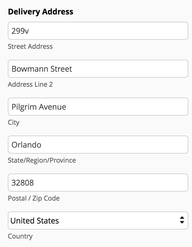
This one's a no-brainer: an order form needs an address field like a ship needs an anchor. How else will you know where to send your products? Collect the shipping and billing addresses for your orders with this essential field.

Unique ID
This field is great when it comes to keeping track of your orders. It remains invisible to the customers when they're filling out the form, but when they hit "submit," you receive a unique reference number for the form submission along with the information that the customer filled out. You can even let your customer know the unique ID by sending a copy of their form submission via email. Now if they have any questions regarding their order, they can just shoot you an email, mentioning the unique ID for reference. Isn't that neat?

Now that you've learned some insider tips for creating a great order form, go on and make exactly the form you need. Or just grab our pre-made template here — you can customize it to suit your business and integrate with your payment accounts to make your work easier.
cool!